Services
Work
Studio
Contact
Services
Work
Studio
Contact
All
Product
Branding
UI/UX
Strategy
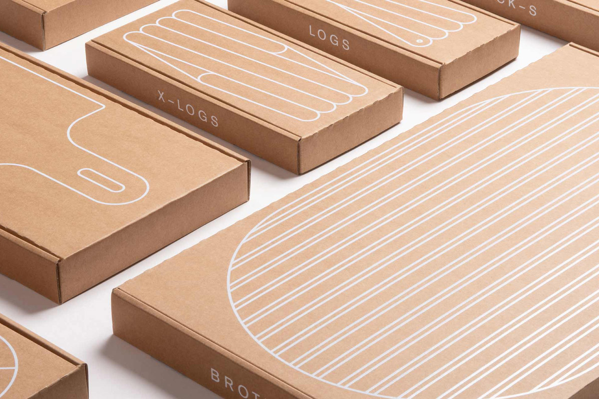
Packaging
Web
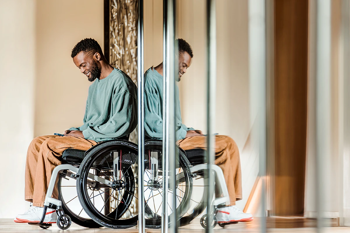
Coming Soon: Meyra Fuse
Coming Soon: Freitag
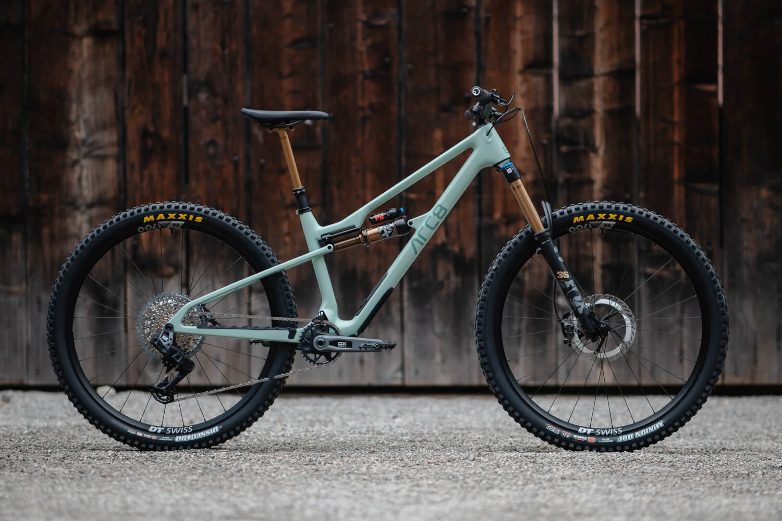
Coming Soon: ARC8 Extra II
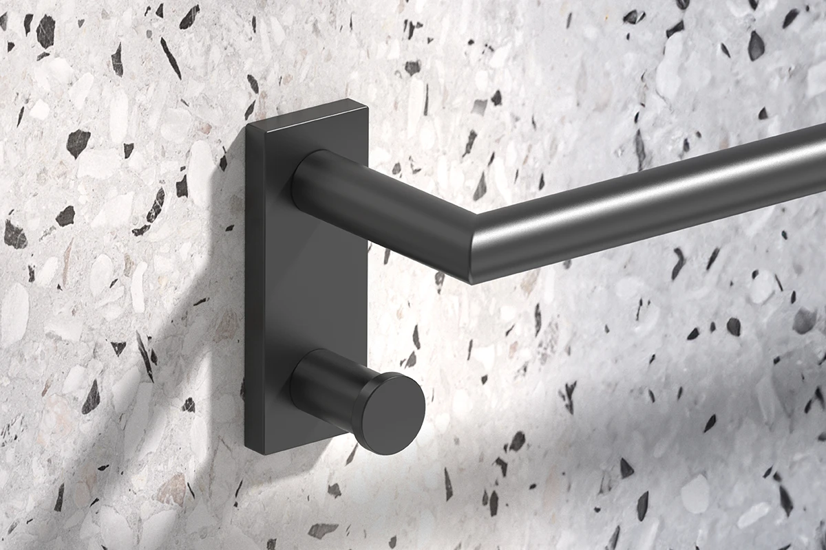
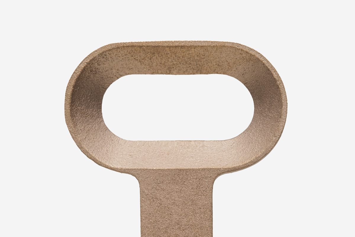
Bodenschatz Signa
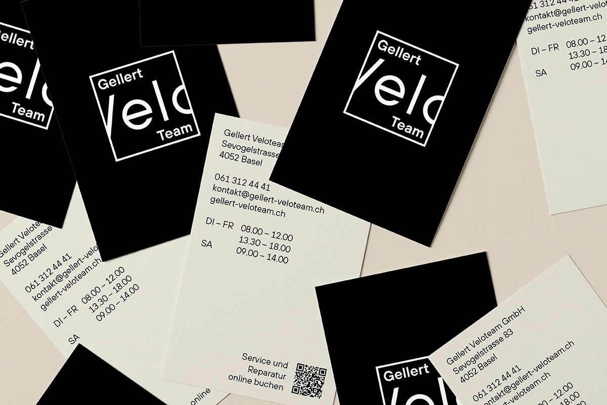
Coming Soon: Gellert Veloteam
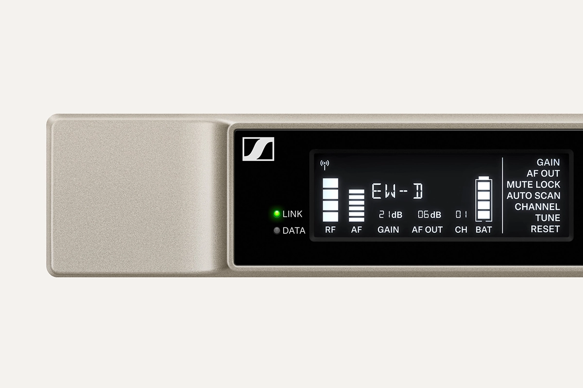
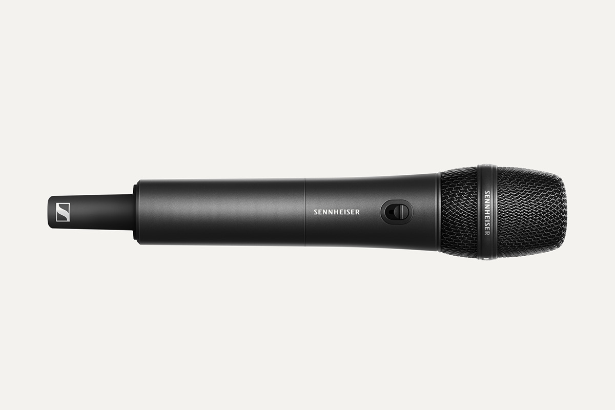
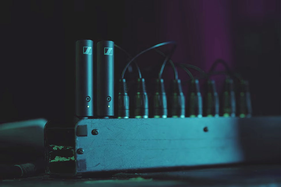
Evolution Wireless Digital
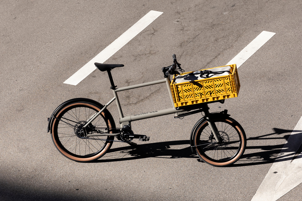
MONoPOLE Toolbike No O1
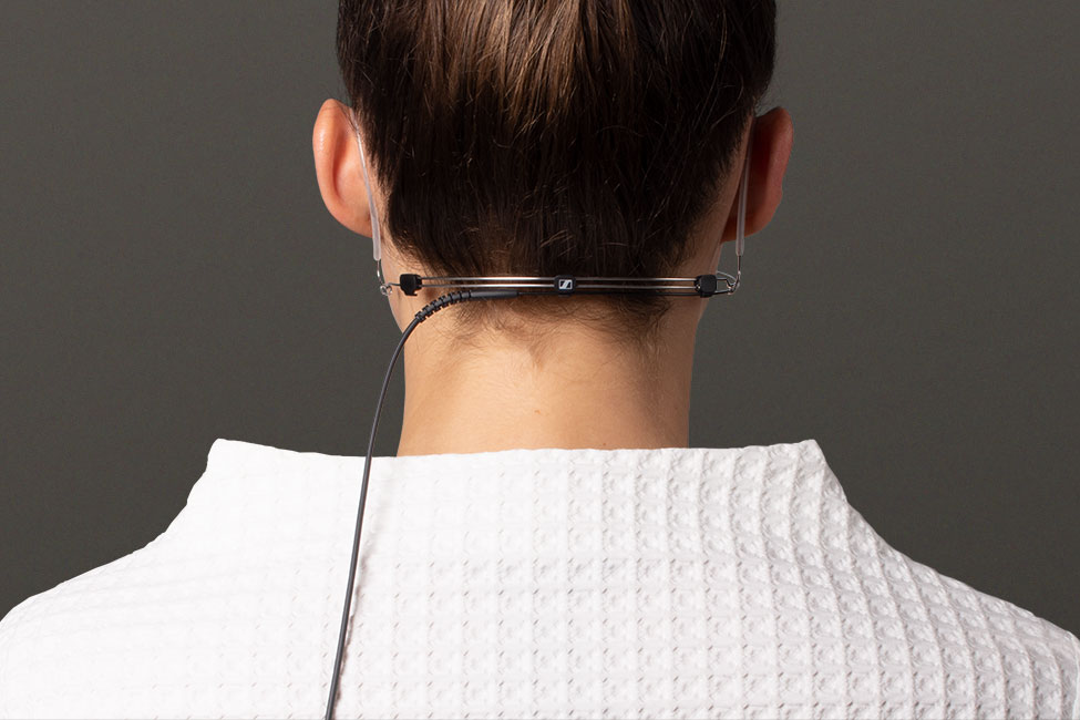
Sennheiser Evolution Wireless Digital
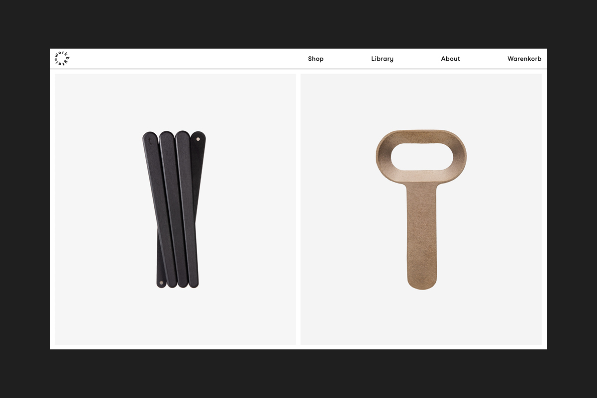
Workbytale Brand
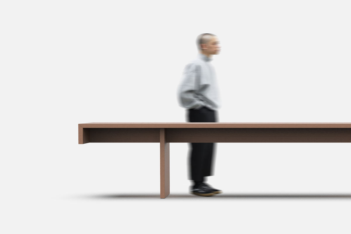
Constructed Sculpture Table
Get Some Popcorn Identity
ARC8 Bicycles Rebranding
Riedel Logo Redesign
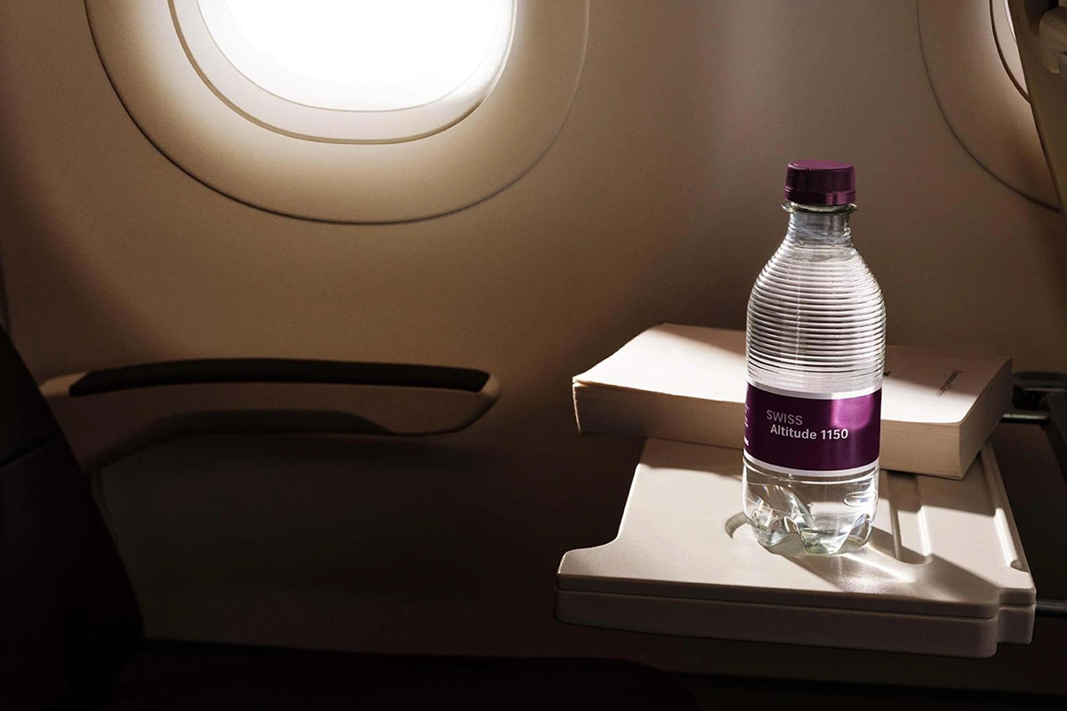
SWISS Onboard Products
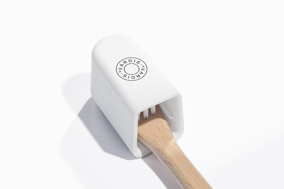
vVardis Switzerland
Sennheiser MKE 200/400
Watch Industry Start-Up
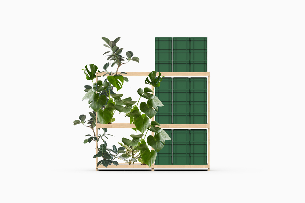
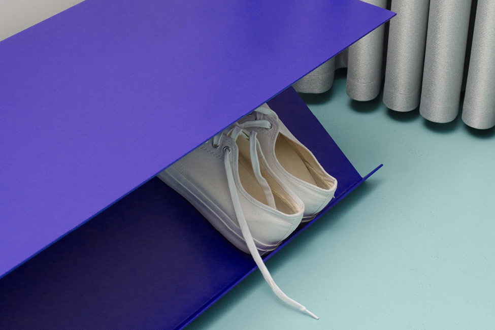
Layout Shelving System
Bodenschatz Chic 22
Stein Made Collection
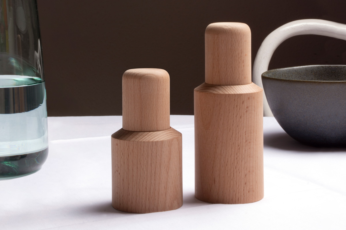
Talsee Source Collection
Camag Laboratory Devices
N.V.L.
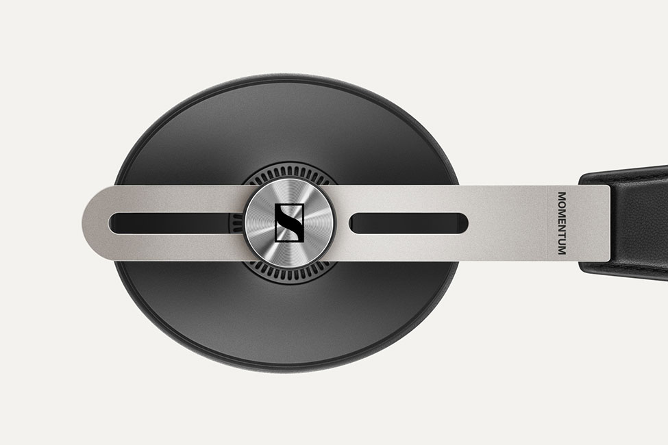
Sennheiser Momentum Wireless
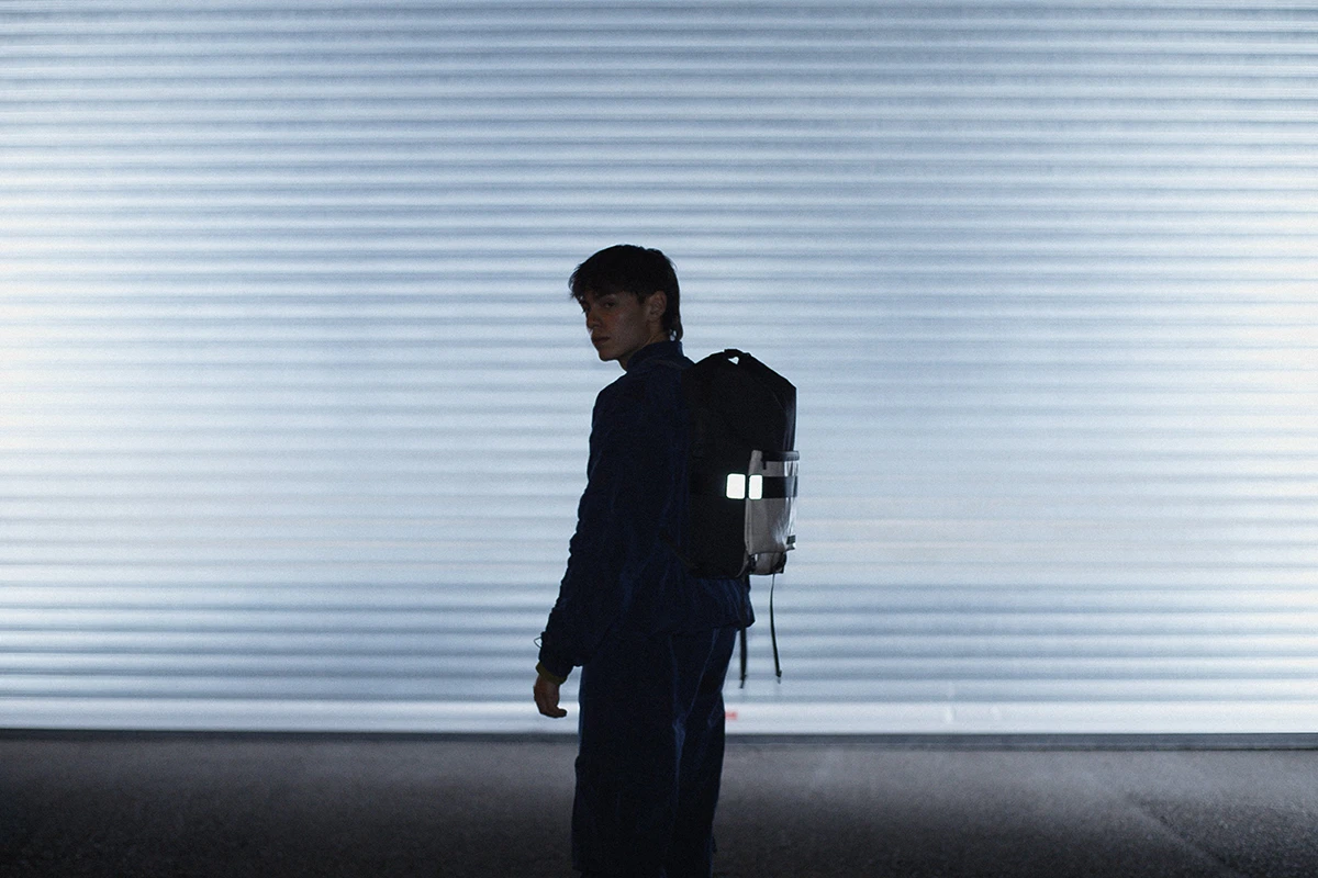
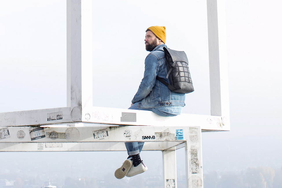
Grid Leather Backpack
Ein – Blicke – Aus
XS Wireless Digital
Open
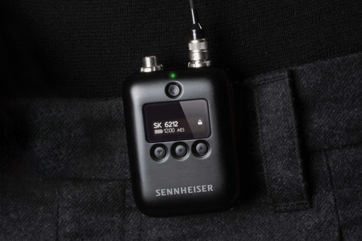
Sennheiser SK6212
Stein Made Brand Identity
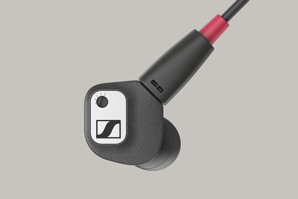
Sennheiser IE 80 S
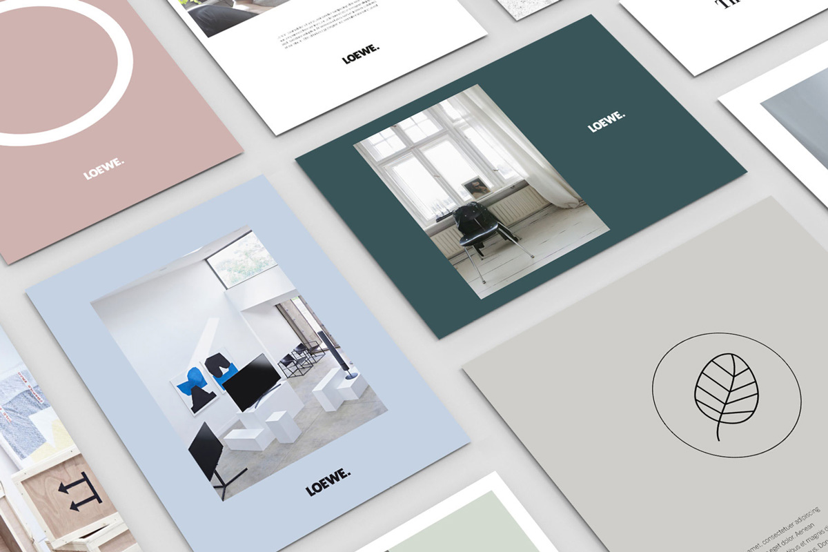
Loewe Brand Refresh
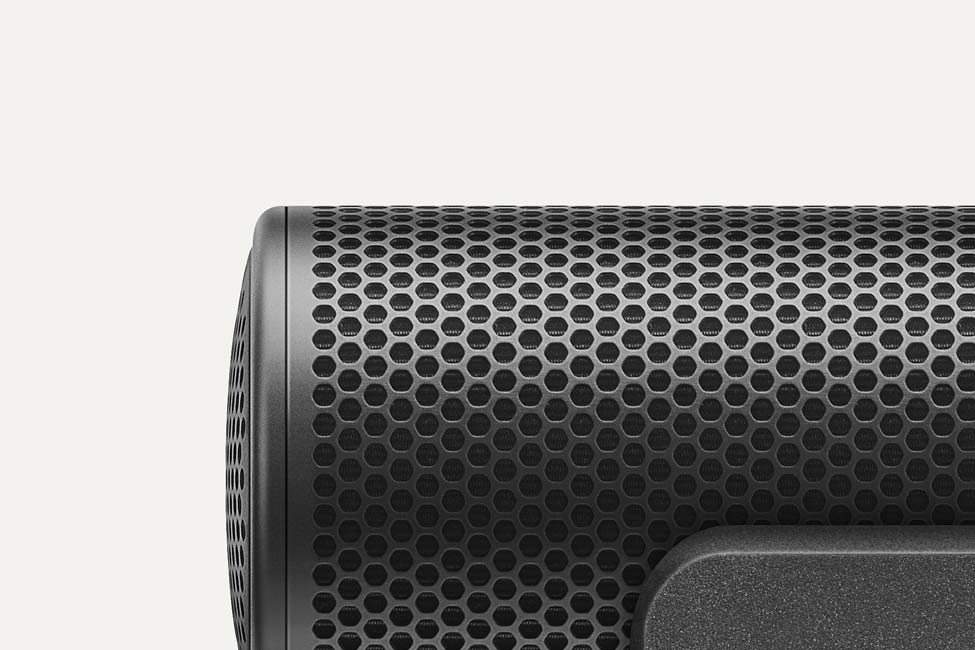
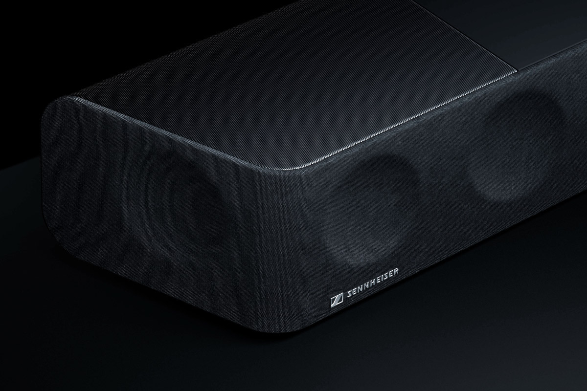
Sennheiser Ambeo Soundbar
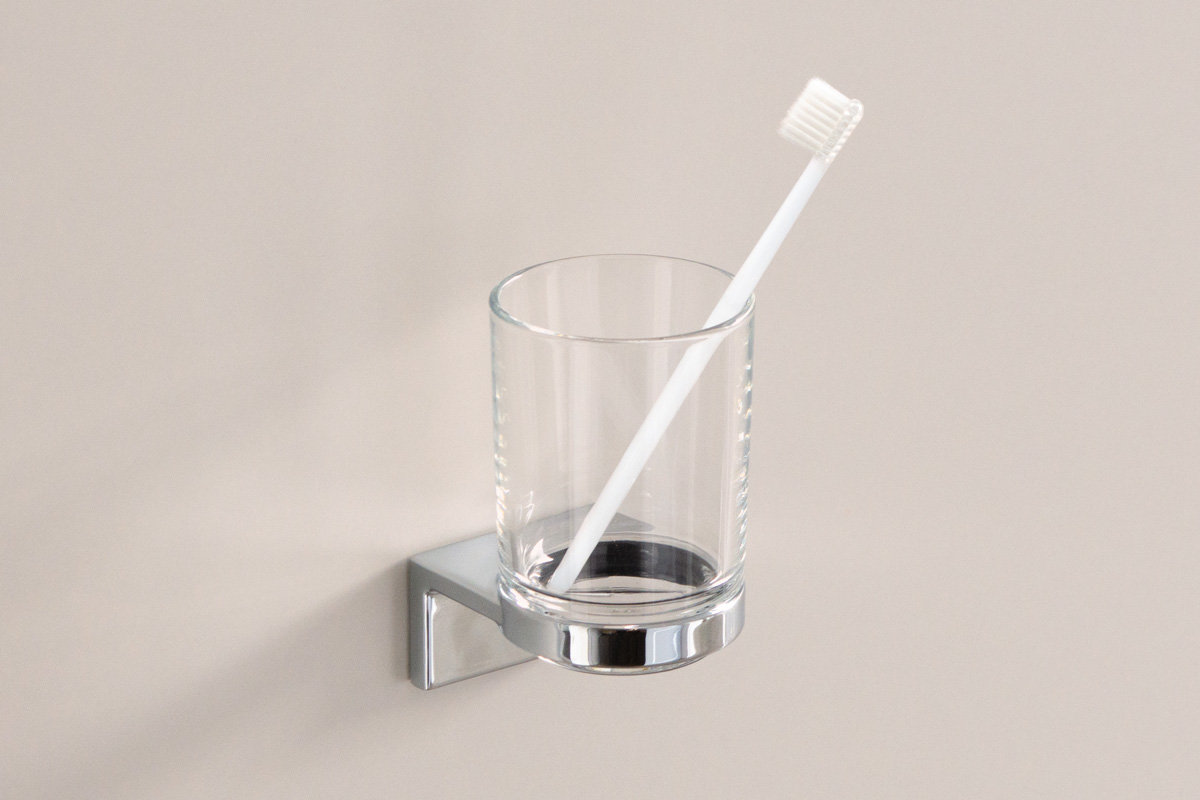
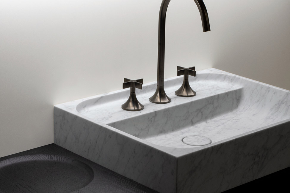
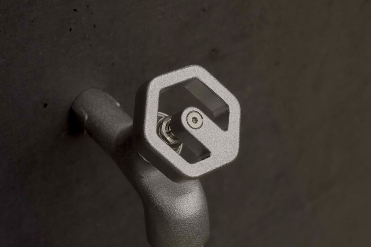
Laufen Hand Wheel
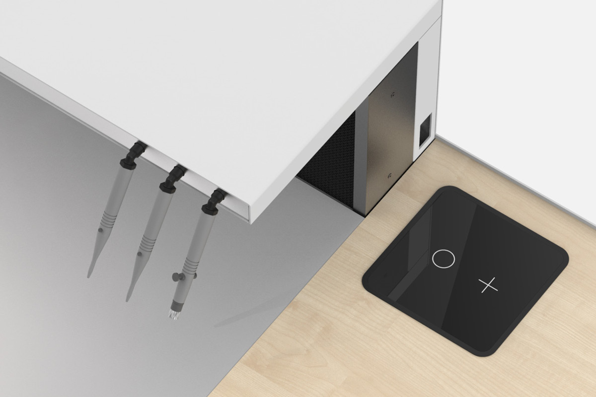
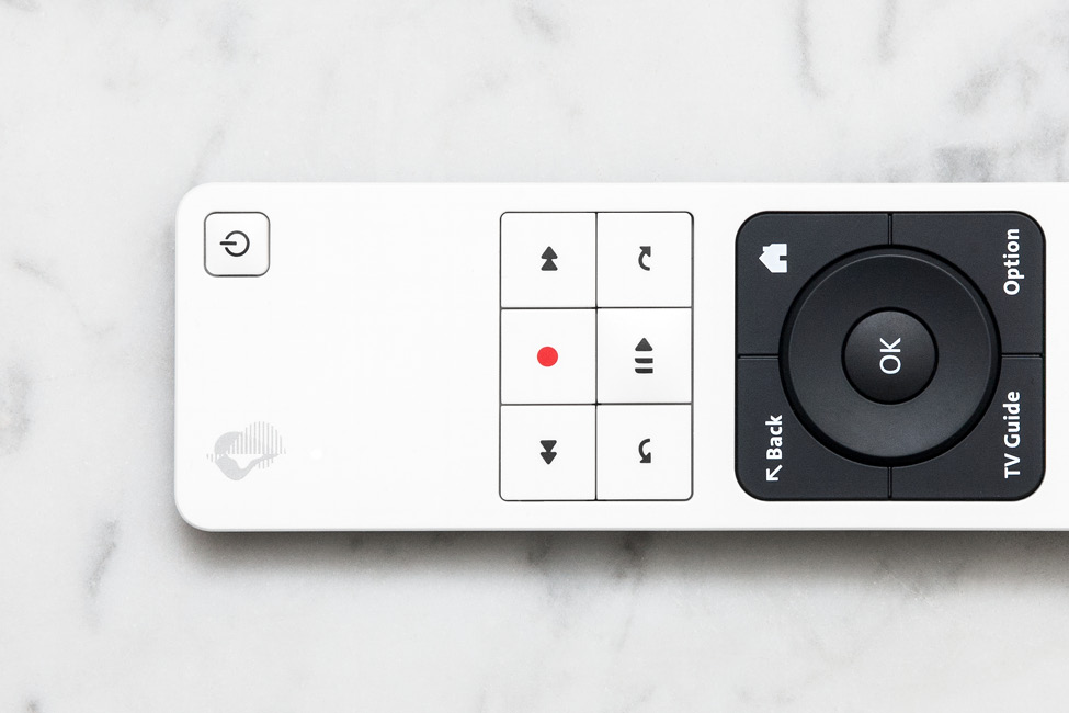
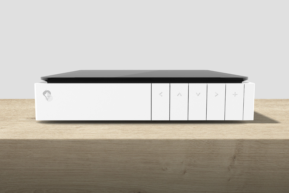
Swisscom Remote
Swisscom Product Design DNA
HSP Essential Omni
vue. Augenzentrum CI/CD
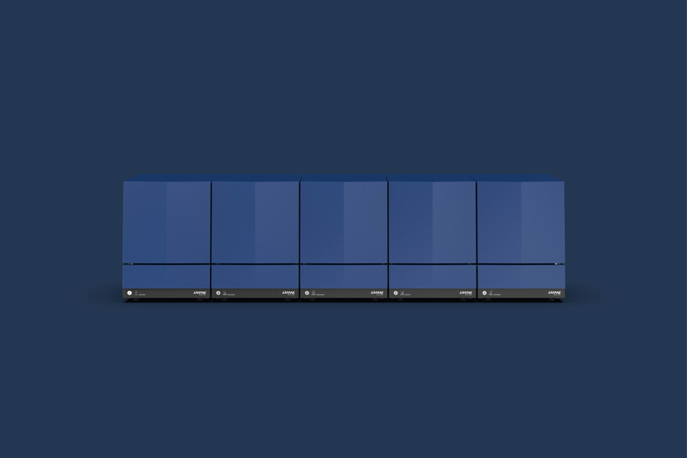
Scale
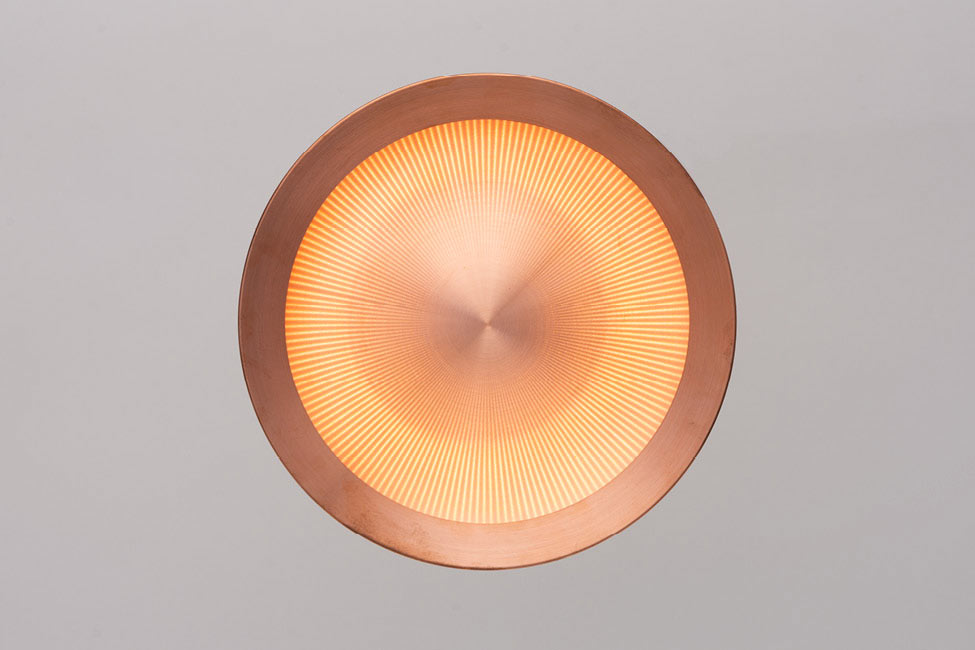
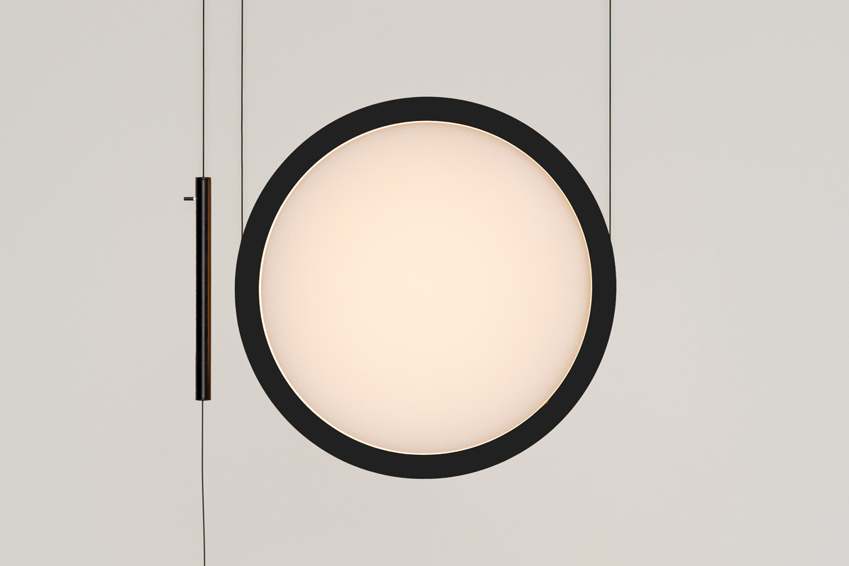
Burri Metro LED
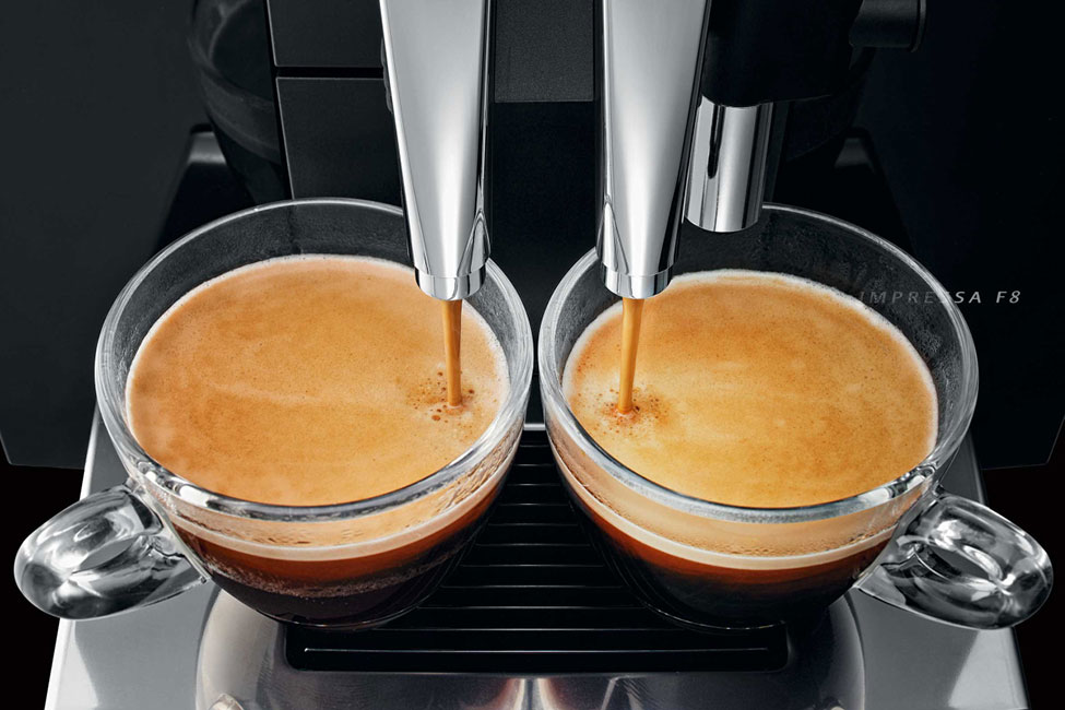
Jura Impressa F8
How High the Moon
Kicks
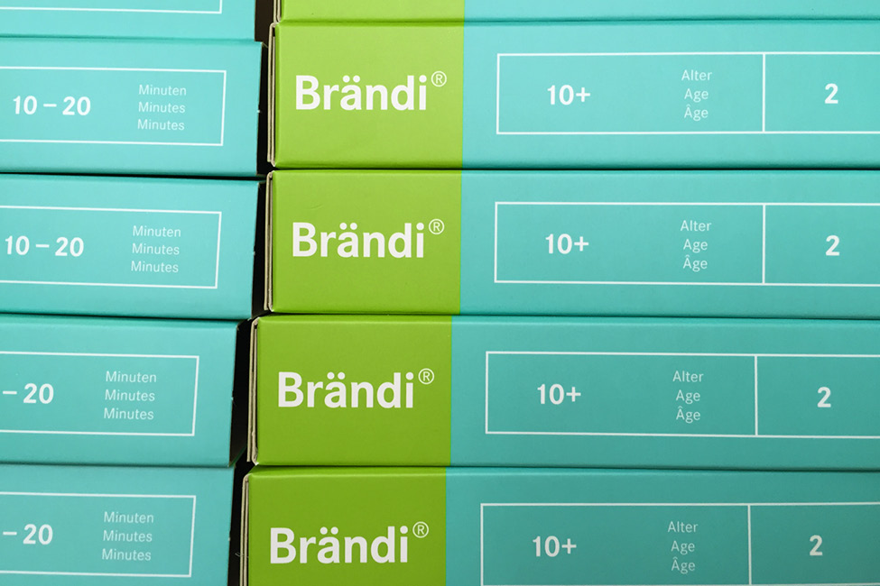
Brändi® Marke
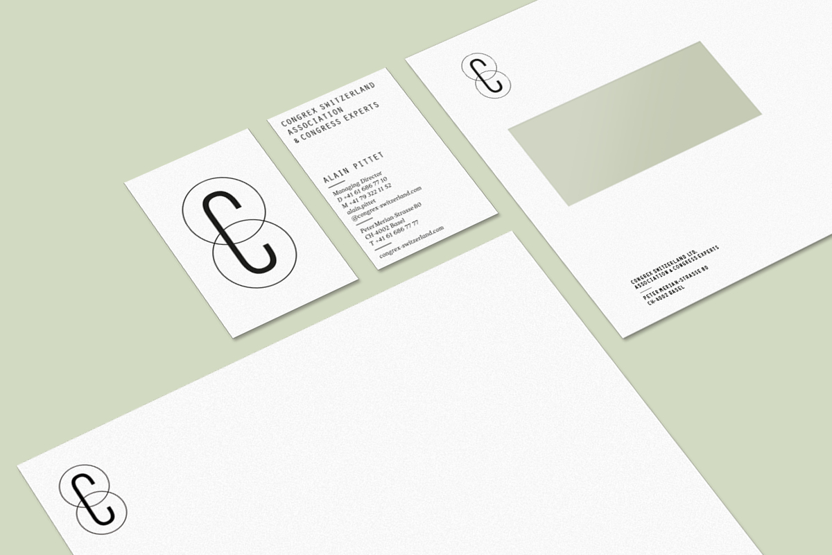
Congrex Corporate Design
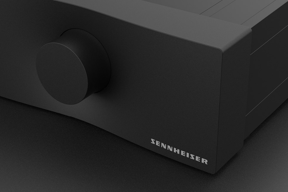
Sennheiser Ambeo Amp